
78 Chart and Diagram Types for Your Prompts
78 charts and diagrams, each with when to use it, how it goes wrong, and a brief you can paste into your prompt. Download the full list as a CSV.

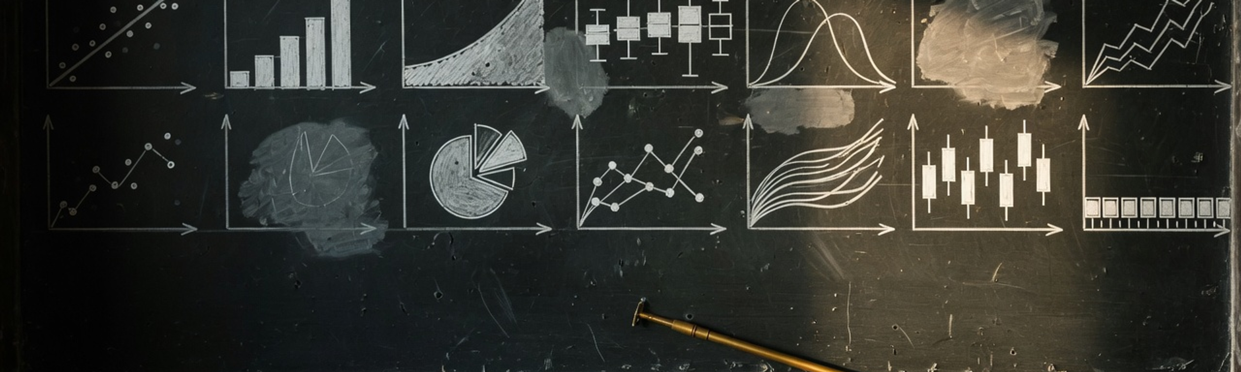
When I ask a model to chart something, I almost always get a chart back. It’s just often the wrong one: a bar chart by default, a pie with seventeen slices, or a line connecting categories that don’t have any order. The model isn’t bad at plotting. It can write Matplotlib, Plotly, D3 or Mermaid all day. It just doesn’t know what the chart is for unless you tell it.
So I put together this list of 78 chart and diagram types. Each card starts with the situation it’s good for, because that’s usually what you know before you know the chart’s name. Open Full details to see how each one tends to go wrong (a bar chart with a cut-off axis, for example, throws off every comparison) and to grab a brief you can paste into your prompt.
Here’s what one of those briefs looks like:
Draw a
It names the chart, says how to label it and points at the story. “Make a chart comparing Q1 and Q3 revenue” gets you none of that.
The briefs work with a coding model (you get plotting code) or an image model (you get a picture). Fill in the <angle brackets> and say which one you want.
Bar chart
Truncating the y-axis. Length is the whole encoding, so a bar chart that does not start at zero has misstated every ratio on it.
Chart brief: Draw a bar chart of <measure> by <category>. Start the y-axis at zero, sort bars by value rather than alphabetically unless the category has a natural order, label each bar's value directly and drop the y-axis ticks, and use one colour throughout with a second colour only on the bar the reader is meant to notice.
Horizontal bar chart
Left as a vertical bar chart with the labels rotated 45 degrees. If the reader has to tilt their head, the chart should have been turned instead.
Chart brief: Draw a horizontal bar chart of <measure> by <category>, sorted descending with the largest bar at the top. Left-align the category labels in a clean column, put the value at the end of each bar, and remove the x-axis entirely, since the labelled bars carry it.
Grouped bar chart
Run past three series per group and it becomes a picket fence. Beyond that, small multiples of single-series bars beat one crowded cluster.
Chart brief: Draw a grouped bar chart of <measure> by <category>, clustered by <series>. Cap it at three series, keep a consistent series order and colour across every group, separate groups with more space than the bars inside a group, and label the series directly on the first group instead of using a legend.
Dot plot
Treated as a lesser bar chart. Above roughly fifteen categories it is the better one: bars turn that many rows into a wall of ink, and dots do not.
Chart brief: Draw a Cleveland dot plot of <measure> by <category>, sorted descending. One dot per row on a light dotted leader line running from the label to the dot, no bars, no fill, and a subtle reference line at <benchmark> so every dot reads as above or below it.
Lollipop chart
Chosen for looks alone. The thin stem reads less precisely than a bar, so it is the right trade only when the ranking matters more than the exact ratios.
Chart brief: Draw a lollipop chart of <measure> by <category>, sorted descending. Thin stems from the zero baseline, one filled circle at each value, no gridlines, values printed above each circle, and a single highlight colour on <the item of interest>.
Dumbbell chart
Used when the two values are not really comparable. The bar between the dots reads as a distance, so it has to mean one: a gap, a change, a disparity.
Chart brief: Draw a dumbbell chart comparing <value A> and <value B> for each <category>, sorted by the size of the gap. Two coloured dots joined by a grey connector per row, the two values labelled once in a legend at the top, and the widest gaps at the top of the chart.
Slope chart
A line chart with two x values. The lines exist to be crossed. If none of them cross, nothing was reordered, and a dumbbell chart says it more plainly.
Chart brief: Draw a slope chart of <measure> between <period A> and <period B>. One line per <category>, labelled with name and value at both ends, no gridlines and no y-axis. Colour the risers one way and the fallers another, grey the flat ones back, and let the crossings carry the story.
Bump chart
Read as a value chart. The y-axis is rank, not magnitude. First place can be a hair ahead or ten times ahead and the line looks identical.
Chart brief: Draw a bump chart of the rank of each <category> across <periods>. Rank 1 at the top, evenly spaced rank rows, smooth lines with a dot at every period, direct labels at both ends, and every line greyed back except <the two to follow>.
Diverging bar chart
Given a colour ramp instead of two colours. The reader needs to see the sign at a glance, and two hues split at the baseline do that; a gradient does not.
Chart brief: Draw a diverging bar chart of <measure> relative to <reference>, sorted from most positive at the top to most negative at the bottom. A single centre baseline at zero, one colour for positive and one for negative, category labels on the side the bar does not occupy, and signed values at the bar ends.
Bullet graph
Replaced by a gauge. A gauge spends a quarter of the screen on one number; a bullet graph fits the same number, its target and its context on one line.
Chart brief: Draw a bullet graph for <measure>. A horizontal track shaded into three qualitative bands from poor to good, a dark measure bar for the current value, and a perpendicular tick marking <target>. Stack one row per KPI on a shared scale, labelled on the left.
Radar chart
Its area is a lie: reorder the axes and the same numbers make a different shape. Use it to read one profile, never to compare more than two.
Chart brief: Draw a radar chart of <item> across <5 to 7 axes>, every axis on the same 0 to 100 scale with the scale printed once. Fill the polygon at low opacity with a solid outline, plot at most two items, and state the axis order in the caption since the shape depends on it.
Histogram
Bin width is a parameter, not a fact. The same data can look normal, bimodal or flat depending on it, so state the bin width or the chart is unfalsifiable.
Chart brief: Draw a histogram of <variable>. Bars touching with no gaps, a stated bin width and the rule used to pick it, counts on the y-axis starting at zero, and a rug or a mean line if the centre matters. Say in the caption how many observations there are.
Density plot
The bandwidth replaces the bin width as the hidden knob, and the curve runs smoothly past the ends of the data into values that never occurred.
Chart brief: Draw a kernel density plot of <variable>, with the bandwidth stated and the actual observations shown as a rug along the axis. Overlay at most three groups at low fill opacity with distinct outlines, and do not extend the curve past the observed range.
Box plot
It hides the shape. Two wildly different distributions, one bimodal and one flat, draw the identical box. That is why the points are worth showing on top.
Chart brief: Draw box plots of <variable> grouped by <category>. Box from the first to third quartile, a median line, whiskers at 1.5 times the interquartile range, outliers as individual points, and the raw observations jittered behind at low opacity. State the n per group.
Violin plot
Drawn with a small n. Below about thirty observations per group the smooth silhouette invents a shape the data cannot support. Show the points instead.
Chart brief: Draw violin plots of <variable> grouped by <category>, with a slim box plot or the quartile marks inside each violin and every observation overlaid as a jittered point. Use a common bandwidth across groups, and skip the violin for any group under thirty observations.
Beeswarm plot
Pushed past a few hundred points per group, where the swarm fuses into a blob and you have drawn a violin the slow way.
Chart brief: Draw a beeswarm plot of <variable> by <category>: one dot per observation, offset sideways only enough to avoid overlap, never vertically. Add a horizontal median line per group, keep dots small and semi-opaque, and switch to a violin above a few hundred points per group.
Ridgeline plot
Overlap tuned for looks. Push it far enough and the front curves eat the ones behind, at which point it is decoration with a legend.
Chart brief: Draw a ridgeline plot of <variable> for each <group>, ordered by <median or time> rather than alphabetically. Overlap the densities by about a third, fill each with a light colour and a solid outline so the ones behind stay readable, and label every ridge on the left.
ECDF plot
Skipped because it looks unfamiliar. It is the only distribution chart with no smoothing parameter at all: every step is one real observation.
Chart brief: Draw an empirical cumulative distribution function of <variable>. A step function from 0 to 1 with no interpolation, reference lines at the median and the 90th percentile, and a second group overlaid as a contrasting step line if you are comparing.
Q-Q plot
Read as pass or fail. The interesting part is where it bends. The tails leaving the line say something different from the middle leaving it.
Chart brief: Draw a Q-Q plot of <variable> against a <normal> distribution. Sample quantiles on y, theoretical on x, a 45-degree reference line, and a shaded simulation envelope so the reader can tell ordinary noise from a real departure in the tails.
Raincloud plot
Built for two groups on a small figure, where three stacked layers become clutter. It earns its complexity when the distributions are the finding.
Chart brief: Draw a raincloud plot of <variable> by <category>: a half violin above, a narrow box plot below it, and the jittered raw points below that, all on one shared axis. One row per group, aligned, with the n printed beside each label.
Scatter plot
Read as causation, and then read as a trend where there is only a cloud. Draw the fit line only when you would defend the model behind it.
Chart brief: Draw a scatter plot of <y variable> against <x variable>, one point per <unit>. Semi-transparent points so overlap is visible, both axes labelled with units, no connecting lines, and a trend line only if you also state the fit and its uncertainty.
Bubble chart
Sizing by radius instead of area. Double the radius and the reader sees four times the value. Scale the area, or the chart quadruples every number.
Chart brief: Draw a bubble chart of <y> against <x> with bubble area (not radius) proportional to <size variable>. Include a size legend with two or three reference bubbles and their values, semi-transparent fills with solid outlines, and direct labels only on the bubbles worth naming.
Connected scatter plot
Left without direction. The path is meaningless unless the reader can tell which end is the start. Mark it, arrow it, or fade the line by date.
Chart brief: Draw a connected scatter plot of <y> against <x> with the points joined in time order. Mark the first and last points clearly, add an arrowhead or a colour gradient to show direction, and label the years at the turning points rather than at every point.
Scatter plot matrix
Shipped to a reader. It is a tool for finding the one pair worth a chart, not the chart. Publish the panel you found, not the grid.
Chart brief: Draw a scatter plot matrix for <variables>. Scatter plots off the diagonal, the variable name and its distribution on the diagonal, shared axis ranges down each column, small semi-transparent points, and correlation coefficients printed in the upper triangle.
Hexbin plot
Used on small data, where it bins away points you could simply have drawn. It starts paying above roughly a thousand observations.
Chart brief: Draw a hexbin plot of <y> against <x> with a sequential colour scale for the count per hexagon and a legend showing the count range. State the number of observations, keep hexagons small enough to preserve structure, and outline them only if the bins are large.
Heatmap
Given a rainbow scale. Rainbow invents boundaries the data does not have. Use one sequential ramp, or a diverging one centred on a value that means something.
Chart brief: Draw a heatmap of <measure> across <rows> and <columns> using a single sequential colour scale with a labelled legend. Sort rows and columns by <a meaningful order or a clustering> rather than alphabetically, and print values in the cells when the grid is small enough to read.
Correlogram
Left as a full square. Half of it mirrors the other half. Drop a triangle and the diagonal, and the reader has half as much to scan.
Chart brief: Draw a correlogram of <variables>: a lower-triangular correlation matrix on a diverging scale centred at zero, with the same colour distance meaning the same correlation in both directions. Order variables by hierarchical clustering, and mark cells that fail significance rather than colouring them in.
Parallel coordinates plot
Axis order is a choice that changes what you can see. Only neighbouring axes reveal a relationship, so a fixed order hides most of the pairs.
Chart brief: Draw a parallel coordinates plot of <records> across <variables>. One vertical axis per variable with its own scale printed, one polyline per record at low opacity, lines coloured by <grouping variable>, and a note that the axis order is adjustable.
Regression band
The line without the band. A fit drawn as a hairline claims a precision the data almost never has. The shaded interval is the honest half of the chart.
Chart brief: Draw a scatter plot of <y> against <x> with a fitted <linear or loess> trend and its confidence band shaded around it. Keep the raw points visible through the band, state the fit method and the interval level in the caption, and do not extrapolate the line past the data.
Line chart
Used for categories. A line asserts that the space between two points is real. Join unordered categories and you have drawn a relationship that does not exist.
Chart brief: Draw a line chart of <measure> over <time>. Time on the x-axis at even intervals, no markers unless the observations are sparse, direct labels at the end of each line instead of a legend, and a visible break in the line wherever data is genuinely missing.
Step chart
Smoothed into a line, which invents a gradual drift between two values that actually jumped. Interest rates and headcounts step; they do not glide.
Chart brief: Draw a step chart of <measure> over <time>, holding each value flat until the next change. Step after the change point, mark the change dates on the axis, and annotate the largest single step with its size.
Area chart
Used for something that is not a magnitude accumulating from zero. The fill says the area means something, and for an index or a rate it means nothing.
Chart brief: Draw an area chart of <measure> over <time>, filled from a zero baseline at moderate opacity with a solid line on top. Only use it when the quantity genuinely accumulates from zero; otherwise draw a plain line.
Stacked area chart
Only the bottom band sits on a flat baseline, so only the bottom band is readable. Every series above it is being read off a wobbling floor.
Chart brief: Draw a stacked area chart of <measure> over <time> broken out by <series>. Put the largest and steadiest series on the bottom, cap it at four or five bands, label each band directly inside it, and add a plain line of the total above if the total is the point.
Streamgraph
Nobody can read a value off it. It shows a shape changing, not a number. Reach for it for texture and follow it with a chart that has a baseline.
Chart brief: Draw a streamgraph of <measure> over <time> by <series>, centred on a floating baseline with the bands ordered so the largest sit near the middle. Label the bands inline where they are thickest, and pair it with a chart that can actually be read for values.
Sparkline
Given axes and a title, at which point it is a small line chart taking up a whole figure. A sparkline lives inside a sentence or a table cell.
Chart brief: Draw a sparkline of <measure> over <time>: no axes, no gridlines, no labels except a dot and value at the final point, sized to sit inline in a table row. Add a light band behind it for the normal range if there is one.
Small multiples
Panels on their own scales. The whole method rests on one shared axis range. Vary it and the grid stops being comparable and becomes twenty unrelated charts.
Chart brief: Draw small multiples of <measure> over <time>, one panel per <category>, on a shared y-axis range with axis labels printed only on the outer panels. Order panels by <a meaningful ranking>, and repeat the overall average as a faint grey line behind every panel.
Candlestick chart
Used for anything without a real open, high, low and close. Four numbers per period is the entire premise; with one number per period it is a line chart.
Chart brief: Draw a candlestick chart of <instrument> over <period>. Body from open to close, wicks to the high and low, one colour for up periods and another for down, a volume histogram in a short panel below sharing the x-axis, and no gaps for non-trading days.
Horizon chart
Handed to a reader who has never seen one. It is the densest time-series chart there is and it needs a one-line explanation of the folding every single time.
Chart brief: Draw a horizon chart of <measure> over <time> for each <series>, folding the values into <three> bands with darker colour for higher magnitude and a mirrored colour for negatives. Stack the rows tightly, label each on the left, and include a short legend explaining the folding.
Calendar heatmap
Given a scale that a few extreme days dominate, leaving eleven months of identical pale squares. Clip the top of the scale or use quantile bins.
Chart brief: Draw a calendar heatmap of <daily measure> for <year>: one square per day, weeks as columns and weekdays as rows, month labels along the top. Use four or five quantile bins rather than a linear scale, and print the bin thresholds in the legend.
Cycle plot
Skipped in favour of a seasonal line, which averages away the thing you wanted: sales can rise every year and still be falling every December.
Chart brief: Draw a cycle plot of <measure>: group the series by <month or weekday>, and inside each group plot the year-over-year trend as a short line with a horizontal mean marker. Keep one shared y-axis, order the groups by the calendar, and label the seasons on the axis.
Control chart
Reacting to every wobble inside the limits. The chart exists to stop that: a point inside the band is noise, and treating it as news makes the process worse.
Chart brief: Draw a control chart of <measure> over <time> with a centre line at the mean and control limits at plus and minus three sigma. Highlight only the points outside the limits or in a run on one side, state how the limits were computed, and annotate the known causes.
Pie chart
Past about five slices, and never two pies side by side. Angle is the weakest quantitative encoding there is. One clear majority is all it reads well.
Chart brief: Draw a pie chart of <measure> by <category> with at most five slices, everything smaller rolled into one Other. Start the largest slice at twelve o'clock going clockwise, label slices directly with name and percentage, and drop the legend.
Donut chart
Sold as more readable than a pie. Removing the centre removes the angle cue and leaves arc length, so the hole is worth it only when you fill it with the number.
Chart brief: Draw a donut chart of <measure> by <category> with at most four segments and the headline figure set large in the centre hole. Order segments by size clockwise from twelve o'clock and label each with its percentage on the arc.
Polar area chart
Its wedges all share an angle and vary by radius, so the eye reads area while the data is in the radius. It flatters small values and inflates large ones.
Chart brief: Draw a polar area chart of <measure> across <12 equal segments>, with the radius scaled so area is proportional to value rather than radius. Include the radial scale rings with labels, and only use it when the categories are genuinely cyclical.
Stacked bar chart
Comparing anything but the bottom segment. Only the bottom one shares a baseline; every segment above it floats, so the eye cannot compare them across bars.
Chart brief: Draw a stacked bar chart of <measure> by <category>, segmented by <series>. Keep the series order identical in every bar with the most important series at the bottom, cap it at four segments, and label the totals above the bars.
100% stacked bar chart
It deletes the totals. A segment can grow from 20% to 40% while the underlying count halves. Print the totals beside the bars or the chart is a half-truth.
Chart brief: Draw a 100% stacked bar chart of <measure> by <category>, every bar normalised to full width. Print the absolute total beside each bar so the shares stay interpretable, keep the segment order constant, and sort bars by the share of <the segment of interest>.
Treemap
Read for precise comparisons. Rectangles of different aspect ratios are hard to compare by area. The chart shows structure and dominance, not values.
Chart brief: Draw a treemap of <measure> across <hierarchy>, using a squarified layout so the rectangles stay close to square. Label only the tiles big enough to hold a label, colour by <top-level group> rather than by value, and show one level of nesting at most.
Sunburst chart
Past three rings, where the outer arcs are too thin to label and too short to compare. It is a navigation control more than a chart.
Chart brief: Draw a sunburst chart of <measure> across <hierarchy>, the root at the centre and each level as a ring outward. Cap it at three rings, colour by top-level branch with lightness varying by depth, and label only arcs wide enough to read.
Mosaic plot
Confused with a 100% stacked bar. The extra idea is the column width: it carries the group size, which is exactly what a normalised bar throws away.
Chart brief: Draw a mosaic plot of <variable A> against <variable B>: column widths proportional to the group size and segment heights to the conditional shares. Shade cells by their deviation from independence on a diverging scale, and keep the category order consistent.
Waffle chart
Used for anything but round-ish percentages. Ten by ten means one square is one percent, so a 37.4% share is a lie the grid cannot tell.
Chart brief: Draw a waffle chart of <measure> as a 10 by 10 grid where one square equals one percent. Fill from the bottom left in reading order, cap it at three categories, and print the percentage beside each category name.
Funnel chart
Used for stages that are not nested. A funnel asserts every stage is a subset of the one above. Apply it to parallel categories and the taper is decoration.
Chart brief: Draw a funnel chart of <count> through <ordered stages>. Print both the absolute count and the step-to-step conversion rate at every stage, highlight the largest single drop, and confirm each stage is genuinely a subset of the one before it.
Waterfall chart
Given more than about eight steps, or steps that overlap. Every bar must be a distinct, additive contribution or the bridge does not actually reconcile.
Chart brief: Draw a waterfall chart from <starting value> to <ending value> through <contributing steps>. Solid anchor bars at each end, floating bars for the steps in one colour for increases and another for decreases, connectors between bars, and a signed label on every step.
Venn diagram
Drawn with proportional-looking circles that are not proportional, or pushed to four sets, where the geometry can no longer show every intersection.
Chart brief: Draw a Venn diagram of <2 or 3 sets> with the count and the label printed in every region including the intersections. Only scale the circles if you are genuinely drawing an area-proportional Euler diagram, and say so if you are.
UpSet plot
Reached for at three sets, where a Venn is simply clearer. It starts winning at four and is the only readable option past five.
Chart brief: Draw an UpSet plot of the intersections among <sets>. A bar chart of intersection sizes on top, a dot matrix below showing which sets each bar belongs to with the dots joined by a line, set sizes as horizontal bars on the left, and intersections sorted by size.
Pareto chart
Left unsorted, or drawn without the cumulative line. The descending order and the running total are the entire method; without both it is just a bar chart.
Chart brief: Draw a Pareto chart of <measure> by <cause>: bars sorted descending on the left axis, a cumulative percentage line on a right axis running 0 to 100, and a reference line at 80% marking where the vital few end.
Sankey diagram
Used where the quantity is not conserved. The whole grammar says what goes in comes out. Apply it to unrelated stages and the ribbon widths mean nothing.
Chart brief: Draw a Sankey diagram of <quantity> flowing from <sources> through <stages> to <destinations>. Ribbon width proportional to volume, nodes ordered to minimise crossings, totals labelled at every node, and losses shown as an explicit outflow rather than a shrinking ribbon.
Alluvial diagram
Read as a Sankey. A Sankey follows a substance through a process; an alluvial follows the same entities as their category membership changes.
Chart brief: Draw an alluvial diagram of <entities> moving between <categories> across <time points>. One stacked column per time point, ribbons carrying the entities that changed group, ribbons coloured by their starting category, and stable groups muted so the switchers stand out.
Chord diagram
Past about eight nodes, where the ribbons occlude each other and the chart becomes a logo. Below that it is unmatched for reciprocal flows.
Chart brief: Draw a chord diagram of <flows> between <entities>, arc length on the circle proportional to each entity's total and ribbon width to the pair volume. Colour ribbons by origin, cap it at eight entities with the rest rolled into Other, and place labels outside the ring.
Arc diagram
Applied to a network with no natural order. The whole advantage is that the nodes sit on a meaningful line. Shuffle them and a node-link layout is better.
Chart brief: Draw an arc diagram of <connections> among <items> laid out along one axis in <their natural order>. Arcs above the line with width or opacity carrying edge weight, node size carrying degree, and the long-range arcs highlighted since those are the interesting ones.
Network graph
Grown into a hairball. Past a couple of hundred nodes the layout is decorative. Filter to a subgraph, or switch to an adjacency matrix.
Chart brief: Draw a network graph of <entities> and <relationships> with a force-directed layout, node size by <degree or centrality> and node colour by <cluster>. Label only the top nodes, thin the edges to the meaningful ones, and note the node and edge counts.
Adjacency matrix
Left in alphabetical order, which scatters the structure into noise. Reorder by clustering and the blocks appear: the ordering is the analysis.
Chart brief: Draw an adjacency matrix of <network>: rows and columns are the nodes, filled cells are the edges, and cell colour carries edge weight. Order rows and columns by a clustering so communities appear as blocks on the diagonal, and mirror the ordering on both axes.
Dendrogram
Cut at a level chosen to give a pleasing number of clusters. The height axis is the evidence. Pick the cut from a gap in the merge heights, not from the answer you wanted.
Chart brief: Draw a dendrogram of <items> from a hierarchical clustering, with the merge distance on the y-axis and the linkage method stated. Draw the cut line where the clusters are taken, colour branches below the cut by cluster, and order leaves to avoid crossings.
Choropleth map
Mapping raw counts. A choropleth colours area, so plotting counts just redraws the population map. Normalise to a rate, or use proportional symbols.
Chart brief: Draw a choropleth map of <rate> by <region>, using a sequential scale with class breaks stated (quantile or Jenks, not equal interval by default). Normalise by population or area, name the projection, and grey out regions with no data rather than colouring them zero.
Proportional symbol map
Sized so the biggest circle swallows its neighbours. Scale by area, cap the largest symbol, and let them overlap at low opacity rather than shrinking them all.
Chart brief: Draw a proportional symbol map of <count> by <location>: circles at the centroids with area proportional to value, semi-transparent so overlaps stay readable, a size legend with three reference values, and a muted basemap so the symbols carry all the contrast.
Dot density map
Dots placed randomly inside a region are not locations. Say what one dot represents and that placement inside the region is arbitrary, or readers will read them as addresses.
Chart brief: Draw a dot density map of <phenomenon> where one dot represents <n units>, dots scattered within each region rather than at centroids. State the dot value in the legend and in the caption, keep dots small and consistent, and drop the region fills.
Tile grid map
Read as geography. It trades real shapes and distances for equal visual weight. That is good for comparing regions and wrong for anything about distance or adjacency.
Chart brief: Draw a tile grid map of <measure> by <region>: one equal-sized square or hexagon per region, arranged to roughly preserve relative position, each labelled with its abbreviation. Note in the caption that the layout is schematic rather than geographic.
Flow map
Every pair drawn, producing a ball of yarn over a continent. Filter to the top flows, or aggregate origins into regions before anything is drawn.
Chart brief: Draw a flow map of <movement> between <origins> and <destinations>: curved links with width proportional to volume, an arrowhead or a colour gradient for direction, only the top flows shown with the rest summarised, and a muted basemap underneath.
Contour map
Drawn over sparse points. Every line between measurements is an interpolation. Show the sample locations, or the smooth surface reads as measured fact.
Chart brief: Draw a contour map of <continuous variable> with evenly spaced isolines, the interval stated, and every few lines labelled with their value. Shade between the lines with a sequential ramp, and plot the underlying sample points so the interpolation is visible as interpolation.
Flowchart
Every box the same shape. The shapes are the notation (rectangles act, diamonds decide, rounded ends start and stop), and flattening them deletes half the meaning.
Chart brief: Draw a flowchart of <process> in Mermaid. Rounded terminals for start and end, rectangles for actions, diamonds for decisions with every branch labelled yes or no, top-to-bottom flow, and no more than fifteen nodes. Split into sub-flowcharts past that.
Sequence diagram
Used to show structure rather than time. Its one axis is ordering. For what talks to what without the ordering, draw an architecture diagram instead.
Chart brief: Draw a sequence diagram in Mermaid for <interaction>. One participant per actor or service, solid arrows for requests and dashed for responses, activation bars for the time a participant is working, and alt or loop blocks for the branches and retries.
Entity-relationship diagram
Drawn without cardinality. One-to-many versus many-to-many is the entire content of the relationship. A plain line between two boxes says nothing.
Chart brief: Draw an entity-relationship diagram in Mermaid for <domain>. One entity per table with its key columns and types listed, crow's foot notation for cardinality on every relationship, relationship labels read as a verb, and junction tables shown explicitly for many-to-many.
State machine diagram
Transitions without triggers. An arrow that does not name the event or guard that fires it describes a wish, not a machine.
Chart brief: Draw a state diagram in Mermaid for <entity>. One node per state, every transition labelled with the event and any guard, an explicit initial state and terminal states, and a note listing which states are legal to enter from outside the system.
Swimlane diagram
Drawn when only one team is involved, where the lanes add ceremony and nothing else. It earns its keep when the handoffs between lanes are the problem.
Chart brief: Draw a swimlane flowchart of <process> with one lane per <team or system>. Keep the flow left to right, put every step in the lane that owns it, and mark each lane crossing as a handoff, since those are what the diagram exists to expose.
Gantt chart
A bar chart of dates with no dependency arrows. Without them nothing shows why a slip in week two moves the finish, which is the only reason to draw one.
Chart brief: Draw a Gantt chart in Mermaid for <project>: one row per task with start and duration, dependency arrows between linked tasks, milestones as diamonds, the critical path highlighted, and today marked as a vertical line.
Timeline
Events spaced evenly rather than by date. If the gaps are not to scale it is an ordered list wearing a line, and the pacing of the story is lost.
Chart brief: Draw a timeline of <events> with the horizontal position proportional to the actual date, not evenly spaced. Alternate labels above and below the axis to avoid collisions, mark eras as shaded bands behind, and call out the one or two turning points.
Org chart
Presented as how work actually flows. It is the reporting structure and nothing else. The real routing usually cuts across it and is worth a second diagram.
Chart brief: Draw an org chart of <team> with solid lines for reporting and dotted lines for matrix relationships. Name and role in every box, collapse groups larger than about eight into a single counted node, and mark open roles distinctly.
Quadrant matrix
Given axes with no scale and items placed by argument. It is a way to structure a discussion. If the positions came from data, draw a scatter plot and say so.
Chart brief: Draw a 2x2 matrix positioning <items> on <axis A> against <axis B>. Name all four quadrants with what they imply, label both axis ends, and state plainly whether positions come from data or from judgement.
Architecture diagram
Drawn at four levels of abstraction at once: a load balancer beside a business capability. Pick one level, say which, and draw the next level as its own diagram.
Chart brief: Draw an architecture diagram of <system> at the <context or container> level of C4, one level only. Boxes for services with their technology named, labelled arrows carrying the protocol and direction, a dashed boundary around what you own, and every external dependency outside it.
no charts match that filter
How to use this
Start from the situation
Filter by family, then read the line under each name. If none of them fits what you’re doing, the question is probably still vague. Better to find that out before anything gets drawn.
Be specific, not vibey
Make it clean barely changes anything, because it’s too vague to act on. Zero baseline, sorted descending, values labelled directly, no legend gives the model four clear instructions, and you can see at a glance whether it followed them.
Two simple charts beat one clever one
If you want an unusual chart, you’re often asking two questions at once. A streamgraph shows how a mix shifts, but you can’t read values off it. Pair it with a plain chart that has a baseline.
Say what your data looks like
The tags on each card tell you what data it needs, like one category and one number, or two time periods. Put that in your brief so the model isn’t guessing. It’s also a quick way to find out a chart needs data you don’t have.
About the thumbnails
Every thumbnail is drawn from the same small set of shapes and colours, so the 78 of them read as one set. Each one has exactly one gold mark, and it shows what the chart is for: the outlier, the crossing, the bottleneck, the biggest slice. If a chart can’t point to its gold mark, it hasn’t decided what it’s showing. That’s the same problem this list is meant to fix.
The whole index as a CSV, free for subscribers. Occasional notes when a new dataset lands — unsubscribe any time.
Ready to build?
The first three intro calls are free. Let's figure out the right approach together.